
this is just a piece i was oraginally goin to use however it
didn't really match my magazine housestyle.


 This is just draft one of my magazine cover and table of content. i am going to improve these further acting upone the possitive critcism.
Making my logo and banner
To make my logo, I started with the Canvas size of A3 then using the fill icon (paint bucket) changed the background colour to black, this is done to make my logo look interesting.
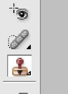
Then I created a new layer. Clicking on the paintbrush, click down on the paintbrush tool at the top of the page and then the arrow (in the red circle shown below) then go to load brushes which are saved on the system.
I have added text to make logo make sense.
There are different types of text styles such as Sans Serif, Serif, Decorative and Script style. Each font style creates a different affect to image where it is us ed. Some websites allow you to download fonts for free such as www.1001freefonts.com.

click download (some wesites hae a different select for mac or windows)click the appropriate one.
If a winzip folder comes up open it otherwise just click open on the window that comes up for downloading the font.
Go to my computer and open the C:drive, then go to a folder called windows and open it. Then inside that folder look for another called font.
Once the font folder is opened copy, drag or paste the font file ending in TTF. The font should be downloaded if not then restart the computer.

Get image on page then duplicate layer. Then on this layer clone out spots and anything unwanted. To make skin look good and clear go to filter, blur, Gaussian blur then make the image 2 pixels. Get eraser tool and erase eyes, lips piecing and anything that is needed to make the image remain real, then make opacity 60%.
To change the eye colour I make mew layer. I go to the brush tool and choose colour, size of brush, make the layer soft light or overlay or anything that I believe is suitable for the image. Then on that layer I will erase any of the eye colour going over eye lids, change opacity of eye to make the image look realistic.
To change the hair colour I will make new layer, choose colour, paint over hair and make layer soft light.
BEFORE AFTER

Colour filtering/colour popping image
Firstly get the image and open in adobe Photoshop. Then crate a new layer by clicking on the new layer tool, and then change the hue and saturation by clicking on the hue and saturation button. Using the lasu key go around the part of the image that I want erased. The reason for this is to make the location of the image the way I want it and taking out what I don’t want in the image. Then clicking on the pencil tool and then the paintbrush icon, I will then click on colour replacement brush. Now clicking on the background would now enable me to shade in the part of the part I wanted erased.
If I want to add txt to this image i would make a new layer and click in the text icon.
In some cases cropping may be necessary and to do this click on the crop tool and and go around the part of the image you want to keep then press the tick tool.

Adding text and gray scale background to image
Get image from file and open in adobe Photoshop then select the hue and saturation make it black and white with the paint tool colour all that I want black and white.


Duplicate the layer and move it to the top then on that layer copy, erase out everything that is meant to be black and white.
BEFORE AFTER


As you can see I have changed the props so that it didn’t have labels on the bags and I have cloned out the teacher at the back.
At the beginning of the course we started analysis images in terms of denotation means what you can see in the picture and connotation is making a connection between objects and what they represent. Mise en scene focuses on camara angles, lighting, props, costume and story the story of the image.
Below I have an image that I will analysis to show how denotation and connotation is used in the image.

This is an image of a red Ferrari F40 car. It has a reflection just under the image of the car. The background is black. The font is italic; the colour of this is white with a red outline. The image consists of the colours such as red, yellow, black and white, orange and grey. The shape of the car is defined in great detail.
The meaning behind the font being italic is to symbolise speed and as it slants to the right this shows the direction in which the car is travelling. They haven’t slanted the font much as it will become hard for the viewer to read. The white font with a red outline suggests to us that this car is dangerous shown with the colour red and the white within the ret outline shows us that even though the car is dangerous it is still angelic and something that everyone should have this. This so that it stands out in this poster. The shadow under the car that is a reflected image of the original car, this symbolises a double personality one of which to show off and be known and the other is of the mysterious character. The black background shows no emotion.


