Sunday 18 January 2009

front cover anaylsis


Forms and conventions of the rolling stone magazine cover.


Magazine cover Anaylisis Rolling stone


what type of magazine is it?

Rolling stone is a us basedmagazine devoted to music,politics and culture that is populer thay is published every two weeks. Rolling Stone was founded in San Francisco in 1967 by Jann Wenner (who is still editor and publisher). The front cover suggests that it targets young reader due to the composition and model on the front cover. The price of the magazine supports this as well. not only does Rolling stone focus on pop music but also actors to get a wider range audience. Because Johnny Depp is on the front cover it is likely to appeal to woman more then men, however I have noticed that as the issue varies there are also celebrities that will attract man to read it too.


From the front cover what kinds of issues/articles are going to be inside?

In the kickers of the magazine it all mentions celebrates that is featured in the magazine. It also says “the political press” which tell the buyer what is installed for them in the issue. The celebrity main image is a sale line for the reader to pick up and read. It says “Johnny sings”. As johnny Depp is well known we can say that this is a major selling point for the audience.


Who is the target audience for the magazine? What particular age group? What are their interests? How do you know all of this?

The target audience is someone who is mid 18 upwards; as the context isn’t really suitable for younger readers due to its context. People who buy it would be looking for a way to escape. Not only does the magazine offer music but also film and book reviews. They will be someone who listens to pop music, rock and roll music and have an interest in films and books. The tone of the magazine is colloquial and humorous, at the same time edifies the audience about what is going on in the political and music, film industries in the world today.


What mode of address does the magazine using? What does this tell you about the relationship it wants with the reader?

The long list of artists shown on the magazine cover suggests to us the sort of context within the magazine. The artists are carefully selected to suit their target audience and so is the main cover image. It wants the reader to be comfortable and enjoy what they read. The word “the heart of Hollywood rebel” said when talking about Jonny Depp singing, the mode of address directs is colloquial to suit the target audience.


What colours are used and does it make the magazine look attractive?

The colours white, gold and black are the main colours used on the magazine; I believe that because they have only used three main colours in this issue, it helps to make the magazine look effective and professional and it is memorable and does not confuse the eye. I also think that the chose of colours are well selected as it allows the magazine to stand out through its simplicity.


Magazine cover analysis
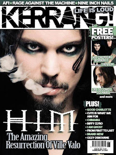
kerrang

What type of magazine is it?

Kerrang is the type of magazine in which features different types of music such as alternative, rock and metal. This is a magazine which is designed for people who do not listen to music such as R&B and pop. This excludes people who do not listen to that specific genre of music. It features bands that are not so known to every one but are famous to those who listen to their sorts of music.


From the front cover what kinds of issues/articles are going to be inside

The magazine issue (1147) has 3 images on the front cover suggesting that all the artists shown on the front cover will have editorial context to make sure that magazine delivers what is promised for them on the cover. On the side of the page it uses images instead of words to show us what is included in the magazine.

What mode of address does the magazine using? What does this tell you about the relationship it wants with the reader?
The use of all the images of the bands and names of some bands on the magazine shows the core buyer the artists it will be featuring, by doing this it shows that they are confident in knowing the exact bands/type of music the target audience listen to and what to know about. This suggests there is a strong relationship between the buyer and creator as they know what the buyer wants and gives it to them. This is also supported by the fact the magazine does not have many sell line(s) to tell the audience the exact type of articles they will be reading. By not doing this it shows there is a trusting and strong relationship between the two.


Who is the target audience for the magazine? What particular age group? What are their interests? How do you know all of this?

It can be said that people who idealise celebrities would be the readers of the magazine. This can be seen as it says “the amazing resurrection of Ville Vola” this almost suggests that he is a godly figure. This would appeal to those who constantly listen to music. The magazine is for both male and female from ages of 14-25. However it is evident that this magazine promotes smoking and alcohol through out some of the content of the magazine. The buyer would read information on gigs, live shows and reviews.

What does the design of the masthead tell you about the magazine?

The masthead can have many representations for it. One of which is that it has rough edges which is warn out but not fully this could symbolize that this magazine is long lasting, it is black which shows no emotion and is bold which makes it eye catching; What colours are used and does it make the magazine look attractive?The colours used in this particular issue is are white, green and black; I have noticed that in each issue black and white is always the traditional colours used for the company house style and there is another colour to represent a new issue.
Results for Questionnaire
from these results I have found that 30% of the people aged 12-17 enjoy the genres hip hop and rock was most favoured. so i will either chose these genres.
most of my target audience said that the preferedthe colours red, black and other however i have used these colours for my plimanary task and i want to go for something new and i recon that the second favoured colours are a good selection and will suit a music magazine more and will be different to existing music magazine so that there is a factor to my magazine that makes it stand out.
most of the audience prefered freebeis so i will chose to inclued posters or cds depending on the price.
for the dissision on the time period for the magazine to issue most said other so i have decided that a fornight issue could be a good decission depending on the price the target audience a willing to spend.

most of the people said 2 pounds is the amount of money they are willing to spend so i essume that they would prefar a fortnight issue for 2 pounds or less so that the magazine could cater for the target audience.

the most prefered name is solidic and its my favourate to as it is unique so i will use this.


Saturday 3 January 2009

mock up of cover and contents page
table of contents

cover


Evaluation for the school of sports magazine.

Front cover
There are many ways in which the magazine produced uses forms and conventions of a real media product. Firstly the masthead is included like most standard magazine cover. I have chosen to use a short heading as it is memorable and eye catching. I was going to use the title “sportlastic” but I figured even though it is catchy, as it is a long work for a magazine masthead, it can possible be easily forgotten. And this title has different meanings behind it and could be misunderstood, by giving the interpretation spastic. So instead I have used “flex” which is short for flexible which is a term which needs to be used in sports, like aerobics and in terms of flexibility of the mind. The colour used is bold and eye catching, and so this follows forms of a real media product. Below the masthead like most standard magazines, it has a strap line. In this strap line I sell my product by saying “Take yourself to the next level” this line makes the magazine very inclusive but will attract my target audience as it addresses them be telling them that going to the next level of their sporting class is achievable if they read the magazine, this is persuasive and direct. My cover however uses a logo which challenges forms and conventions of a standard magazine.
I have used a button on the cover so that it conforms to a real magazine. They are used to promote special features and articles within the magazine. I have used it to advertise a celebrity giving a cartoon drawing for a lesson to learn. This will attract the students as it is a vital aspect in this issue for a specific group of students. The button is inclusive as it is aimed at a specific sporting group. Kickers are used on most standard magazines. They are used to explain the key features to students that will also help sell the magazine. I have only used one kicker, this challenges forms and conventions of a real magazine as most of them have around 6 kickers. The mode of address is inclusive to sport students at the school and each issue changes with the term to suit different sporting groups. Through the main image and button it is easy to tell that this issue is aimed at boxing students. The text is informal as I target students at the school to be the audience to the magazine.
My cover uses what is usually expected from real magazines, as it uses at the most of three different fonts on the front cover. Over all I believe that magazine complies with the forms and conventions of real media product. I have also included a bar code and price which helps complete the magazine. As it is a school I have set the price as free as it should be accessible to all students if it is suppose to take students “to the next level”.
My front cover represents a large and varied group of people. Using the term “flex” as the masthead should appeal to all of the sporting students as it has many meanings for the word it uses red and black which are contrasting colours to show that to be part of flex you need balance opposites. E.g. you must have a clear mind when you fight in a tournament. The kicker is inclusive to students, and appeals greatly to the students within the school as there is a competition held for all students.
There are many ways in which my front cover attracts and addresses my audience.
My front cover targets students from this sport school in many ways. Firstly, there are the colours that I have used. The red is suppose to appeal to people from the school as this is one of the school’s house colours as the kit is red, white and black. Also the completion is aimed at all students as it will be to answer a question that should be a question that the students can automatically know the answer too as it is a question vital for all the students written examination. And ‘what’s the next move’ is telling all the students that they should start to think about what’s next for them. These all factors of my a magazine that helps to promote different activities that are happening within the school, therefore it appeals to keen students who like to take part.

Contents
My contents page uses many conventions and forms as other real contents pages use. I have incorporated page numbers, images and information about the different features that is contained in the magazine. It is also laid out in a well structured way, making it easy for the reader to understand. However I have chosen to put my own unique style in the format of the contents page. By doing this I have challenged conventions of real contents pages. I have chosen to place images on both corners of the right hand side of the page and one in the middle of the left hand side of the page. I have done this to balance the page out. This also can be seen as the key element of the school code balance if one reads into the positioning and colour the medium uses. Secondly, I have chosen to add make my background, two shades of gray instead of having just a plain background because I felt that having just a white background will, firstly blend in with the main image and will be too uninteresting and plain, which will result in audience not appealing to the magazine. Making the background a two toned gray shows the reader that they last time the school was analysed it was the second best so the gray gives an allusion of silver. My contents page appeals widely students who do a form of martial arts at the school. However there are cover story’s that will apply to every student like “ways in which students can prevent injury”. Although this is an internal magazine, it will interest people externally who have an interest in martial arts. My contents page also appeals to students it uses colours of the school house style. Not only have I used black and white for the background, I have also used images of students taking part in different martial art activities. These activities would appeal to students as they are available to everyone in the school community who choose to join these classes.

The kind of media institution that will distribute the FLEX magazine.
The magazine is free as this is a private school the students will have to pay a fee to study sports at the school. This pays for the equipment and specialist staff and also all the study equipment, this includes study material and so the magazine will be paid for through the allowance used as study material. So, this means that the magazine would be distributed at school, as it is extremely inclusive to students and school life.

The audience for your media product.
The audience for my magazine would be students at this private School of sports. This is clear because the language is inclusive to the school environment.

Aspects I have leant from the process of constructing this product.
I have learnt many techniques, all to do with using adobe Photoshop. I have found it extremely fascinating how I can merge an image taken myself and put it into another, I found this especially challenging but thoroughly enjoyed the experience of making the magazine cover and contents page on adobe Photoshop.
front cover finished document