Forms and conventions of the rolling stone magazine cover.
Magazine cover Anaylisis Rolling stone
what type of magazine is it?
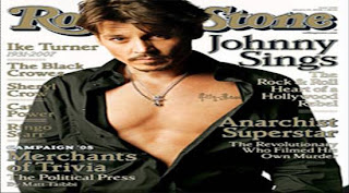
Rolling stone is a us basedmagazine devoted to music,politics and culture that is populer thay is published every two weeks. Rolling Stone was founded in San Francisco in 1967 by Jann Wenner (who is still editor and publisher). The front cover suggests that it targets young reader due to the composition and model on the front cover. The price of the magazine supports this as well. not only does Rolling stone focus on pop music but also actors to get a wider range audience. Because Johnny Depp is on the front cover it is likely to appeal to woman more then men, however I have noticed that as the issue varies there are also celebrities that will attract man to read it too.
From the front cover what kinds of issues/articles are going to be inside?
In the kickers of the magazine it all mentions celebrates that is featured in the magazine. It also says “the political press” which tell the buyer what is installed for them in the issue. The celebrity main image is a sale line for the reader to pick up and read. It says “Johnny sings”. As johnny Depp is well known we can say that this is a major selling point for the audience.
Who is the target audience for the magazine? What particular age group? What are their interests? How do you know all of this?
The target audience is someone who is mid 18 upwards; as the context isn’t really suitable for younger readers due to its context. People who buy it would be looking for a way to escape. Not only does the magazine offer music but also film and book reviews. They will be someone who listens to pop music, rock and roll music and have an interest in films and books. The tone of the magazine is colloquial and humorous, at the same time edifies the audience about what is going on in the political and music, film industries in the world today.
What mode of address does the magazine using? What does this tell you about the relationship it wants with the reader?
The long list of artists shown on the magazine cover suggests to us the sort of context within the magazine. The artists are carefully selected to suit their target audience and so is the main cover image. It wants the reader to be comfortable and enjoy what they read. The word “the heart of Hollywood rebel” said when talking about Jonny Depp singing, the mode of address directs is colloquial to suit the target audience.
What colours are used and does it make the magazine look attractive?
The colours white, gold and black are the main colours used on the magazine; I believe that because they have only used three main colours in this issue, it helps to make the magazine look effective and professional and it is memorable and does not confuse the eye. I also think that the chose of colours are well selected as it allows the magazine to stand out through its simplicity.

Magazine cover analysis
kerrang
kerrang
What type of magazine is it?
Kerrang is the type of magazine in which features different types of music such as alternative, rock and metal. This is a magazine which is designed for people who do not listen to music such as R&B and pop. This excludes people who do not listen to that specific genre of music. It features bands that are not so known to every one but are famous to those who listen to their sorts of music.
From the front cover what kinds of issues/articles are going to be inside
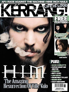
The magazine issue (1147) has 3 images on the front cover suggesting that all the artists shown on the front cover will have editorial context to make sure that magazine delivers what is promised for them on the cover. On the side of the page it uses images instead of words to show us what is included in the magazine.
What mode of address does the magazine using? What does this tell you about the relationship it wants with the reader?
The use of all the images of the bands and names of some bands on the magazine shows the core buyer the artists it will be featuring, by doing this it shows that they are confident in knowing the exact bands/type of music the target audience listen to and what to know about. This suggests there is a strong relationship between the buyer and creator as they know what the buyer wants and gives it to them. This is also supported by the fact the magazine does not have many sell line(s) to tell the audience the exact type of articles they will be reading. By not doing this it shows there is a trusting and strong relationship between the two.
Who is the target audience for the magazine? What particular age group? What are their interests? How do you know all of this?
It can be said that people who idealise celebrities would be the readers of the magazine. This can be seen as it says “the amazing resurrection of Ville Vola” this almost suggests that he is a godly figure. This would appeal to those who constantly listen to music. The magazine is for both male and female from ages of 14-25. However it is evident that this magazine promotes smoking and alcohol through out some of the content of the magazine. The buyer would read information on gigs, live shows and reviews.
What does the design of the masthead tell you about the magazine?
The masthead can have many representations for it. One of which is that it has rough edges which is warn out but not fully this could symbolize that this magazine is long lasting, it is black which shows no emotion and is bold which makes it eye catching; What colours are used and does it make the magazine look attractive?The colours used in this particular issue is are white, green and black; I have noticed that in each issue black and white is always the traditional colours used for the company house style and there is another colour to represent a new issue.


No comments:
Post a Comment