Thursday, 19 February 2009

mood board


This is my mood board. These are images of the sort of music I like and what I will aim to achieve, i got colors that i may also be targeting to use. the genre of music artists used in my moodboard is both R&B an Rock.

Saturday, 14 February 2009

presentation.


Slide 1: this video is pretty much self explanatory. Matt Heafy talks about how his group has always been doing solos since 1999 and he says “I guess it takes this long to be discovered” there favourite bans are interested in it and that’s why they also do this form of music. On this clip we find an extract of the sort of music they produce. They went on tour with Metallica and they are good friends with them there hero is Metallica and matt says “that’s the best thing anyone can ever ask for, having your hero approve and like of what you’re doing”. This tells us that even though they are not well known, they are favoured by the band that they aspire t be like.


Slide 2: a natural way of reading the page is a c-flow when following conventions of a standard double page spread. A z-flow usually is used on single pages like the cover of a magazine. The eye travels from the top left hand corner of the page to the middle of the left hand page back to the right at the bottom of the page. Our eyes natural cover both the pages using this theory.
Observing the double page spread I have found that the slug is in the top left hand corer on the left sided page. This conforms to standard conventions of real magazines and is used to tell the reader what the content of the page is about.


Slide 3: the pull quote from this page says “some people have the smallest bit of fame and turn into total dicks” from this quote we can gather that the language is very colloquial we also find that perhaps they themselves know that they don’t want to be famous as they know the outcome and resolution if they did become famous. Not only can we tell from the pull quote that the language is colloquial but we can also see this through most of the content on the double page spread and throughout the magazine. It says “wanna be a rockstar? Trivium reveals the science bit” and just by this small printed words that can hardly be noticed is a column just by it given a title “avoid shit talking”. This is humorous language as it indirectly comments that “science is shit”.
Slide 4: evaluating the title “karrang” and the title “the rules of rock” of the double page spread I find that the same style is consistent throughout. When looking at “karrang” it looks like there are light rays in the word which could suggest raving and night clubs and the deformity of the words also suggests that there isn’t stability in the people who may buy the magazine.
Looking at the deformity of the word “rock” we can see that it looks like the texture of something solid like a rock that is disintegrating. This is like the title of the magazine which makes it consistent.

Slide 5: from the magazine cover and the double page spread you can see that there are a few linkages to help make the magazine look consistent throughout. The main cover line is written across the page and similarly the title of the double page spread is also diagonal. Another linkage is the positioning of the people in the image there are four people on the cover and four people on the double page spread. Most of the text on the cover and double page spread is on the right and side. And finally the colour of the text is usually white.
Slide 6: buzz words like rules and secrets word appeal to the core buyer as it attracts and entices the reader to read on further. The word rules give the reader the impression that these are guidelines or a religious book which makes it seem like rock has its own individual religion. And the word secrets tempt the reader to believe that the content reveals something that couldn’t be revealed anywhere else.

Friday, 13 February 2009

final magazine cover


Magazine Front Cover and Commentary
Commentary for my magazine Front coverWhen I conducted my questionnaire I asked them to pick three colours as I was going to use three body colours for the front cover of my magazine however in production I used two which was Red and White for the cove line, sell line and masthead; I did have a third colour which was black because it was the colour of his clothes. As a result of this I thought it would have been better if I didn’t include the blue as it would appear to be an anomaly colour. These two colours were also the most popular scoring 20% which was the same. I put the initial cost of the magazine as £1.50 because in my questionnaire I asked them the price they were willing to purchase a magazine for and whether they read magazines on a daily basis. From these answer I thought that I could make my music magazine a weekly one at the price of £1.50 as people would be willing to buy it on a weekly basis. I interpreted this from the answer that they read magazines on a daily basis.Two main images are on the front cover of the same person to indicate that the magazine is mainly about them also according to the results I collected half of the respondent’s said that images attract them to a magazine therefore by placing two on the front cover I am trying to attract a audience that is caught by images rather than colour which is shown by the limited amount of colours I have used. The use of a guitar was something that I though of before when I did my mood board as I had a rough idea of the genre the magazine was going to be before I conducted the questionnaire. The image in the middle uses a low angle shot this was used to emphases his passion of music which is also shown in his facial expressions. The colour red has many meanings and one of the connotations is passion. If someone was looking at the image and looking for the denotation I hope they would come to the conclusion of a young male, enthusiastic in music, the use of black shoes his power and the red his passion. The camera angle used for the foreground was also low angle this is because it shows his passion for music once again. I wanted to make this point very clear which is why I have used it twice.From the images shown on my plan it is clear to see that I have uses Adobe Photoshop to change the colour of his pants from Black to Red. I did this because I originally had no red due and as I needed to use this colour I thought it would be a good idea to make something red so that everything on the page goes together. To do this I used Airbrushing and changed the layer to Soft light to give the effect I was looking for. I have also changed the image used for the foreground from landscape to portrait. To do this I used the magic lasso tool on Adobe Photoshop.I choose this location because it reminds me of a recording studio or some type of studio that someone would practice their music once more leading to the idea of his passion for music. I wanted to look at passion because hopefully the target audience will see some personal identity in their love for music and his. It can also be used as escapism to get away from the real world and gain inspiration to be there if it is their dream.The target audience will be someone from the ages of 15-18 which is similar age to the target audience of the magazines I looked at for the double page spread. I have not really done anything which goes against the conventions of the magazine except on the barcode as it appears to be transparent and doe not have any numbers. I have done this because the magazine is not going to be sold in a shop so it will be purchased without scanning. The barcode was placed on the magazine so it looks more professional. It is inclusive to a school but not for any particular genre of music as each issue will have a different theme on a different genre of music.

questionnaire


I asked a range of different questions so that dissisions of my magazine will be based around what my audience prefere I will also find out my target audience and what they look for in a magazine.
when creating my questionnire I got insperation from other questionnaires that ask for similer things. Most of the questions will helped to build the magazine to follow the conventions of standard magazines.

real cousework mock up, mashead plan and photoshoot


I was taking a various amount of images so that I can choose the best shot that would suit my magazine cover the best. these are just some of the shots that I have taken.

photoshoot plan

this is my plan for my photoshoot. i will take as meny of these shoots as posiblle and then i will select the best ones that seem to look the best and most appropriate.
Mock up


Sunday, 18 January 2009

front cover anaylsis


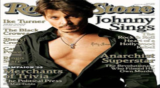
Forms and conventions of the rolling stone magazine cover.


Magazine cover Anaylisis Rolling stone


what type of magazine is it?

Rolling stone is a us basedmagazine devoted to music,politics and culture that is populer thay is published every two weeks. Rolling Stone was founded in San Francisco in 1967 by Jann Wenner (who is still editor and publisher). The front cover suggests that it targets young reader due to the composition and model on the front cover. The price of the magazine supports this as well. not only does Rolling stone focus on pop music but also actors to get a wider range audience. Because Johnny Depp is on the front cover it is likely to appeal to woman more then men, however I have noticed that as the issue varies there are also celebrities that will attract man to read it too.


From the front cover what kinds of issues/articles are going to be inside?

In the kickers of the magazine it all mentions celebrates that is featured in the magazine. It also says “the political press” which tell the buyer what is installed for them in the issue. The celebrity main image is a sale line for the reader to pick up and read. It says “Johnny sings”. As johnny Depp is well known we can say that this is a major selling point for the audience.


Who is the target audience for the magazine? What particular age group? What are their interests? How do you know all of this?

The target audience is someone who is mid 18 upwards; as the context isn’t really suitable for younger readers due to its context. People who buy it would be looking for a way to escape. Not only does the magazine offer music but also film and book reviews. They will be someone who listens to pop music, rock and roll music and have an interest in films and books. The tone of the magazine is colloquial and humorous, at the same time edifies the audience about what is going on in the political and music, film industries in the world today.


What mode of address does the magazine using? What does this tell you about the relationship it wants with the reader?

The long list of artists shown on the magazine cover suggests to us the sort of context within the magazine. The artists are carefully selected to suit their target audience and so is the main cover image. It wants the reader to be comfortable and enjoy what they read. The word “the heart of Hollywood rebel” said when talking about Jonny Depp singing, the mode of address directs is colloquial to suit the target audience.


What colours are used and does it make the magazine look attractive?

The colours white, gold and black are the main colours used on the magazine; I believe that because they have only used three main colours in this issue, it helps to make the magazine look effective and professional and it is memorable and does not confuse the eye. I also think that the chose of colours are well selected as it allows the magazine to stand out through its simplicity.


Magazine cover analysis
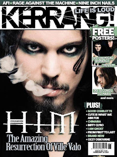
kerrang

What type of magazine is it?

Kerrang is the type of magazine in which features different types of music such as alternative, rock and metal. This is a magazine which is designed for people who do not listen to music such as R&B and pop. This excludes people who do not listen to that specific genre of music. It features bands that are not so known to every one but are famous to those who listen to their sorts of music.


From the front cover what kinds of issues/articles are going to be inside

The magazine issue (1147) has 3 images on the front cover suggesting that all the artists shown on the front cover will have editorial context to make sure that magazine delivers what is promised for them on the cover. On the side of the page it uses images instead of words to show us what is included in the magazine.

What mode of address does the magazine using? What does this tell you about the relationship it wants with the reader?
The use of all the images of the bands and names of some bands on the magazine shows the core buyer the artists it will be featuring, by doing this it shows that they are confident in knowing the exact bands/type of music the target audience listen to and what to know about. This suggests there is a strong relationship between the buyer and creator as they know what the buyer wants and gives it to them. This is also supported by the fact the magazine does not have many sell line(s) to tell the audience the exact type of articles they will be reading. By not doing this it shows there is a trusting and strong relationship between the two.


Who is the target audience for the magazine? What particular age group? What are their interests? How do you know all of this?

It can be said that people who idealise celebrities would be the readers of the magazine. This can be seen as it says “the amazing resurrection of Ville Vola” this almost suggests that he is a godly figure. This would appeal to those who constantly listen to music. The magazine is for both male and female from ages of 14-25. However it is evident that this magazine promotes smoking and alcohol through out some of the content of the magazine. The buyer would read information on gigs, live shows and reviews.

What does the design of the masthead tell you about the magazine?

The masthead can have many representations for it. One of which is that it has rough edges which is warn out but not fully this could symbolize that this magazine is long lasting, it is black which shows no emotion and is bold which makes it eye catching; What colours are used and does it make the magazine look attractive?The colours used in this particular issue is are white, green and black; I have noticed that in each issue black and white is always the traditional colours used for the company house style and there is another colour to represent a new issue.
Results for Questionnaire
from these results I have found that 30% of the people aged 12-17 enjoy the genres hip hop and rock was most favoured. so i will either chose these genres.
most of my target audience said that the preferedthe colours red, black and other however i have used these colours for my plimanary task and i want to go for something new and i recon that the second favoured colours are a good selection and will suit a music magazine more and will be different to existing music magazine so that there is a factor to my magazine that makes it stand out.
most of the audience prefered freebeis so i will chose to inclued posters or cds depending on the price.
for the dissision on the time period for the magazine to issue most said other so i have decided that a fornight issue could be a good decission depending on the price the target audience a willing to spend.

most of the people said 2 pounds is the amount of money they are willing to spend so i essume that they would prefar a fortnight issue for 2 pounds or less so that the magazine could cater for the target audience.

the most prefered name is solidic and its my favourate to as it is unique so i will use this.