Evaluation
For my advanced portfolio I produced a teaser trailer for a film entitled ETCH.
The purpose of the teaser trailer is to entices the audience and create suspense over the audience. It raises many questions and keeps the audience at the edge of their seat. in general, it is used to tease the audience, to set up certain expectations for the audience and to leave questions for the audience to answer and build on their own from their own knowledge from knowing what to expect from the genre. And it was also important to give the audience some sense of the genre of the forthcoming film.
Todorov argued that it was important to have theory of genre as of narrative. This is because it sets of expectations for the audience and so they know generally what kind of film their watching. Narrative is just the way the story is presented through the clip and then it is generalised as a certain category, which shows how it could be argued that a theory of genre is more important than narrative. Each new product presents itself in relation to the generic norms but also has an influence on them. The definition of genres cannot be fixed but paradigms (conventions) may be recognised.
The genre of the film is horror/thriller. Usually the thriller genre is a hybrid with another genre. The genre is established through the use of mise en scene (talk about each) location, costume, lighting, props, where I have adhered to the conventions of the genre. However, in terms of editing I have not conformed to using fast cuts, which would be more conventional. Instead, I used cuts that matched the sound track to add to the suspense and creepiness of the film and It adds to the detachedness of the story. I did this because I wanted to shock the audience at the end of the clip to add to the suspense, which has been carried out throughout the teaser trailer.
The lighting throughout the teaser is set up as dark and dull to meet the convention of a horror movie. It brings the viewers closer and captures the atmosphere that the film is going for making the audience believe that they are also part of the film.
The costume is set up to be stereotypical for the genre as I have chosen to use a black cloak worn by the villain and a black mask. However, the way we have challenged the standard convention of the costume is by adding a pattern on the mask. The symbolism behind this was so that it would show how the villain had a contrast in their personality like the two contrasting colours on their mask, it is etched on to their mask and cannot be separated like their personality, hence the reason for the title.
Some of the props used are unique to the genre, such as the yellow and red pill, this fits in more with the thriller genre category as but it is still a product that isn’t regularly used as a prop to decide life and death. By using this, I tried to evoke a new paradigm adding more excitement for the audience by presenting a fresh idea. Fake blood is a standard prop used for the horror genre as usually, the events that occur in them is death caused by violence.
Finally, the location creates a sense of entrapment in an environment that should be comfortable and safe. This causes the feeling of closure and endings for the audience adding to the adrenalin of the genre. All of these are used to create shock, thrill and scare.
The standard codes and conventions for this kind of genre can also be seen in films such as scream directed by Wes Craven in 1997. This film was put under the category genres: horror/thriller/mystery/crime. Another film with these conventions is Saw, directed by James Wan 2004. The film was put under the genre: horror, thriller and mystery. Familiarity with a genre means we know how it works: we find our own way around a text without too much difficulty and I wanted to get the genre established by using the standard conventions as well as portray my own ideas of what I believe horror should be.
The general themes used in ETCH is tricks and fears and masks and duality. These follow a certain group of horrors and open a new door for horrors as it also is about a psychological thriller combined with horror.
The reason why we chose not to give the film the age rating 15 and made it 18 is because it included realistic violence which would have not been suitable for under 18’s.Although this may close doors to the audience, the film doesn’t benefit people younger as it is purely made for the purpose of escapism. However, I also realise that people under the age 18 will enjoy the film and would watch it when they buy the DVD for pleasure.
Deconstruct in terms of iconography and link to real texts where possible: soundtrack/mise en scene, location, costume, props, make-up camera angle/shot, editing, sound. Are these typical or do they challenge expectations.
Generally, when a label (genre category) is given to a film, it sets up certain expectations for the film. However, it is the job of the film for the audience to know what to expect from the film but at the same time, they should feel that there is an unexpected situation, which they would want to find out. This is how genre attracts the audience.
How will generic of production appeal to the audience?
In a horror, the audience will expect that there will be a murderer and challenges for the characters as well as the audience to solve throughout the film. The audience will appeal to this as the audience find the genre that they are watching satisfying, as they know that they are set with certain expectations.
Saturday, 24 April 2010
Wednesday, 31 March 2010
progress
Below, is a documentation of my original time plan that was created for the purpose of me to structure and manage the tasks ahead of me.Using a Gantt chart technique helped me to understand the duration for each task and how I can break down the task in the week.
Planning
now reflecting back at my original time plan, I can look closely at what i have achieved in the time i initailly set.I planned to finish the website, poster and teaser by 23rd of march. Although i have met the deadline of the same week, i still haven't updated aspects which should have been finised on that date. Also i took extra time for filming because of the quility of the shot when we began to edit the teaser. the lighting was poor and had to be ajusted.
Althought the original plan considers aspects such as holidays, i forgot about my proority over my extended project quilification and studing for my resits, also, I study subjects that have a big pecentage for coursework and so, i have been over loaded with ork and deadlines to meet every week.
The editing process started later on and so left us little time for editing, so we were given an extentin due to circumstances, we then stayed after school often in order to meet the new deadline.
Thursday, 25 March 2010
Final Website and Poster


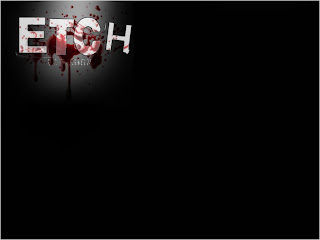
How I designed the title
this is the URL to my website: http://www.stmaryleboneschool.com/studentsite/media/shenaz/
Monday, 22 March 2010
Friday, 19 March 2010
Thursday, 18 March 2010
draft of posters and websites
Drafts and Final
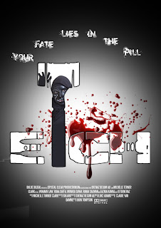
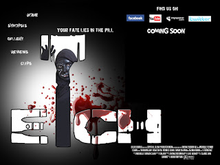
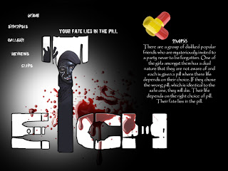
These are my drafts of my poster and website designs in order of development. i had changed my design so many times due to my target audience feedback. Many said that the first draft was nice but looks as if there is to much going on on the page.
By my final draft me and some of the target audience finally agreed that the final design suits the purpose of interesting the audience.
Subscribe to:
Comments (Atom)


